Different flavors of Visual Analysis:
Often times the line-charts that I commonly use (click here) are helpful for me to Visually Analyze the markets, and at times I use the Heatmaps to Visually Analyze the markets.
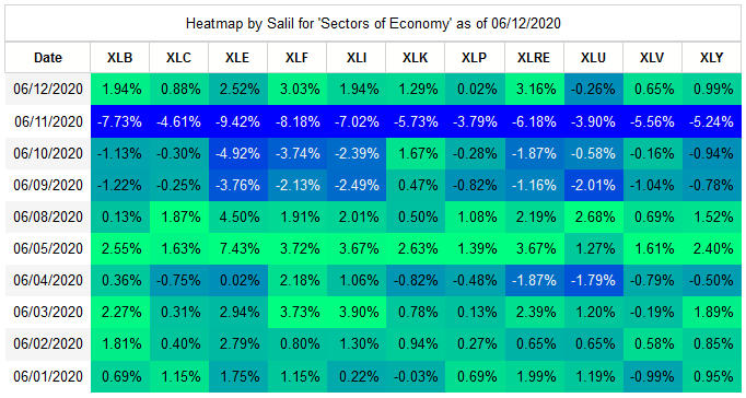
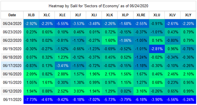
The sharp downturn financial markets suffered on 6/11/2020 was experienced across the 11 sectors of American Stock Market. This type of downturn of course is visible in the line-charts, however the relative comparison of how the impact was felt for the 11 sectors is not quite apparent in the line-charts. The Heatmaps are ideal in such a situation.
Line-charts show the absolute prices plotted across the time-series, but in the Heatmaps, rather than using the absolute prices, I've used the relative performance from day-after-day i.e. how much was a particular ETF up or down by percentage in comparison to previous day. In technical analysis this measure is the ROC(1) - rate of change over 1 day. The visual part of analysis is the difference in hue and intensity of the colors for negative/positive percentage changes for different ETFs over the last 10 days. Using Python it's possible to create large Heatmaps for "n" number of days. As a trader I prefer to trade very rapidly, so I tend to focus the Heatmaps on short time-span. I limit the Heatmaps to 10 trading days only - that's approximately 2 calendar weeks.
The 11 sectors of American Stock Market:
Investopedia lists the 11 sectors of American Stock market. The ETFs by SPDR represent these sectors quite well.
(1) XLB = Materials (2) XLC = Telecommunication Services (3) XLE = Energy (4) XLF = Financials (5) XLI = Industrials
(6) XLK = Information Technology (7) XLP = Consumer Staples (8) XLRE = Real Estate (9) XLU = Utilities
(10) XLV = Health Care (11) XLY = Consumer Discretionary
I generate the Heatmaps for these sectors and others every day. The screen-grab I generated yesterday is given below where the drop experinced is noticible for 6/11/2020.
Intelligence (hopefully Actionable) from Visual Analysis:
The purpose of most charting is to derieve intelligence based on it - which is hopefully actionable, for generating systematic profits.. In the Heatmaps below there is obvious intelligence about the strong positive corelation demonstrated by the vast majority of the markets. ... Now that's hisorical, not much of actionable intelligence in it. Is there? ... What's likely actionable is not the day 06/11/2020, rather it's the day-after *smile*. That's where the indication of how strongly/weakly/not-at-all has the particular ETF bounced back is there. Perhaps that's actionable for the future. Question I need to answer is that, as a trader can I use this intelligence to generate some profit? (BTW, it's not at all necessary that the ETF that has bounced back strongly only is the candiddate for profit. The ETF that has not bounced-back at all could also be considered as the candidate to short-sell.) And then there is the trading day-after that - I'm writing this on Sunday 6/14/2020, so the trading day is going to be tomorrow, so the Heatmap I will generate tomorrow using EOD data will (hopefully) give some more intelligence.
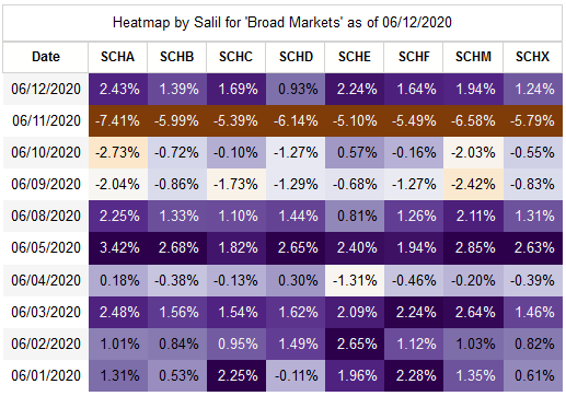
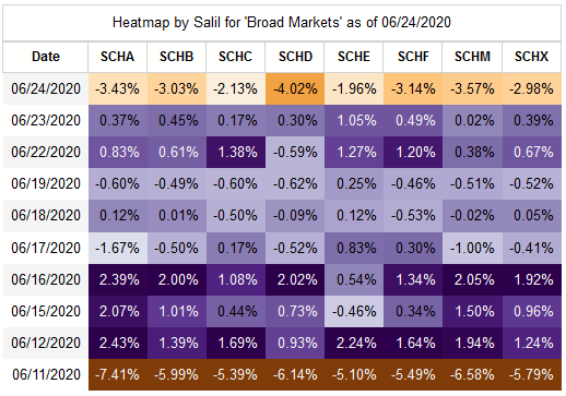
Heatmap for broad market ETFs:
Charles Schwab has ETTs that represent broad markets. By different markets - domestic/internation, and market-cpitalization - small/mid-large.
(1) SCHA = US Small-cap (2) SCHB = Broad US Markets (3) SCHC = International Small-cap (4) SCHD = US Dividend Paying Equities
(5) SCHE = Emerging Markets Equities (6) SCHF = International Equities (7) SCHM = US Mid-Cap (8) SCHX = US Large-cap
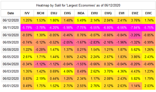
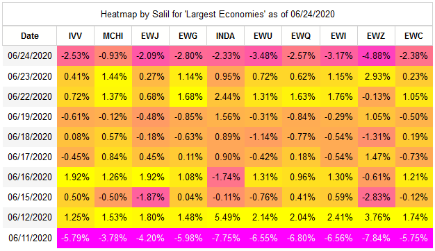
Heatmap for ETFs for largest Economies of the World:
iShares has many ETFs that represent the largest economies of the World.
(1) IVV = USA (2) MCHI = China (3) EWJ = Japan (4) EWG = Germany (5) INDA = India
(6) EWU = United Kingdom (9) EWQ = France (9) EWI = Italy (10) EWC = Canada
Python Coding:
I am a trader/coder. Earlier details are focused on Trading, here are a few details that are related to Coding !
I use Python/Pandas/MatPlotLib/Request/Selenium etc. to perform lot of visualization, analysis, and trading. For this specific analysis using heatmap visualization, I've done a general purpose "config" that I use in Python for each group for which the heatmap is plotted.
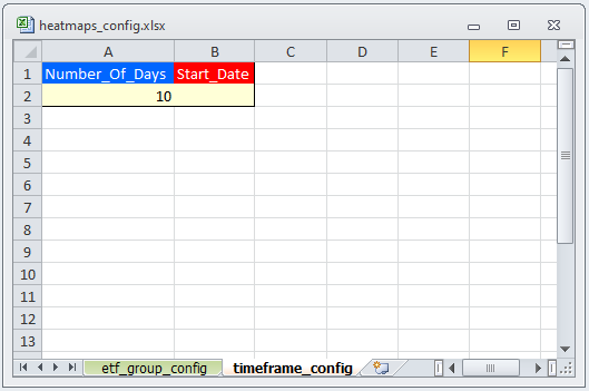
I've placed the config in the Excel workbook given below which is read by the Python program I've developed. Program renders the heatmap based on these configs.
The worksheet 'etf_group_config' has the details for Groups of ETFs and the related configurations.
The first row has the title of the visualization that gets in between the verbiage 'Heatmap by Salil' and 'as of mm/dd/yyyy'.
The second row has the colormap applied when rendering the heatmap. (This is described in more detail in the section below.)
The third row onwards are the different ETFs that make-up the particular group.
This config has advatge that it gives me flexibility. I can insert/update/delete Groups by using the columns, and I can insert/update/delete ETFs within a group by using the rows, without changing code at all.
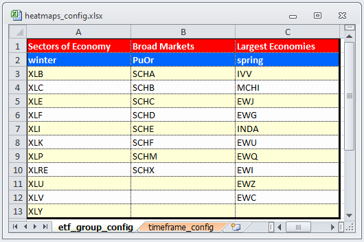
The worksheet 'timeframe_config' has the details for timeframe that I want to get the heatmaps for. This is where I specify the number of days that I was the heatmap for (typically it's 10), and in rare situations if I want to see how the heatmap was for a any historical period, then I can make the start_date to any back-date. (Again - flexibility to drive the program using just the config.) In the image below the 'empty' Start_Date means use the present date, rather than a back-date.
Python MatPlotLib Colormaps:
There are a large number of color maps available in the Python library MatPlotLib for coloring the Heatmaps.
ROC(1) measure can be visualized via many different mappings in the Heatmaps, I've used "winter", and "spring" mapping for 'Sectors of Economy' and 'Lagest Economies', and I've used "PuOr" from "Diverging colormaps" for 'Broad Markets' to depict these Heatmaps.
Click here to see the maps from MatPlotLib.
Epilogue for Heatmaps - Reversion To Mean:
Definition of the term 'Mean Reversion' is given on Investopedia under the "Advanced Technical Analysis" concept.
The RTM - reversion-to-mean- is the cornerstone of my trading. It's the third certainty of the financial markets. Today (6/24/2020) there was a drop in the markets, and coincidentally it so happens that it was within the 10 trading days span of last big market downturn of 6/11/2020.
Perhaps this is an example of RTM.
The three elements of RTM - (a) The mean (b) The rate of reversion-to-mean and (c) Volitility around the mean are not visible in the Heatmaps, however these Heatmaps are clearly showing the reversion between 6/11/2020 and 6/24/2020. There are other ways to analyze/visualize (a), (b) and (c). I prefer indicator ATR (average-true-range) to measure the volitility. ATR ignores the Rate-of-Reversion and the Mean value itself.
Once again, the Heatmap depict today's drop very well, perhaps a little better than the depiction in the Line charts. These Heatmaps show the interim pattern of gain/loss in between the two big drops.
Giving the three Heatmaps below, that I generate every day.
All the 11 sectors of American Stock market had a drop, but Utilities (XLU) were able to minimize the losses.
The broad markets suffered losses with most severe losses were seen in Dividend Paying Equities (SCHD).
All the 10 top economies of the world suffered losses, with Brazil (EWZ) being the one to suffer the most, and China (MCHI) to suffer the least.
|